Tips for Staging Your Photos - Props, Backdrops and the Overall "Feel"
/**Disclaimer: I am in no way a "professional photographer". I do, however, have plenty of experience in taking photos, as I've been dabbling in it for years. I'm just sharing some things that have helped me!**
Hey there! I'm here again talking photos - and in this post, I'm going to be covering photo staging.
(Side note, you can see the first post of this photo series by clicking here. In it, I talk all about inspiration-- a great precursor to this post!)
Staging and planning out a photo is one of my favorite parts of the photography process. You get to flex those creative muscles in a different way than when designing or crocheting. And you get to play with all sorts of props and styles to create the look you want. I always view it as a fun challenge to showcase either what I'm currently working on or a finished product.
In my previous post about inspiration, I talked about branding... and defined it as what people are perceiving of your business when they see the photos you take or the products you make. It's what they feel when you present something to them. This is important to note because I think this is something you should most definitely be thinking about when you get ready to point your camera at your product. I believe you appear more trustworthy and professional when you have consistent style and a clear definition of who you are (and who you serve) as a brand. So if you're unsure about what your business is all about or confused about who your audience is I would 100% recommend going and reading that post real quick.. (find it here)
So in this post I want to give you some fun little tips and ideas about how I stage and set up the photos I take. I'll talk about props, backdrops, and setting the scene for your product to shine. I provide this information not for you to go and use all the exact same props I use, or have my same style, but rather so you can take what I do, and make it your own.
Props
Now I think we all should know that your product is the star of the show. It's what is making you the money. It's essentially what your business is about. But sometimes your product needs a little boost from it's trusty helpers: the props.
Now, I will say there are times when simplicity is your thang, and all you want to do is take a photo of your hat on a white background. And I can dig that.. because sometimes that's truly all you need to display your killer product. And that may be your style-- I'm all for it. But I do want to talk about the power of a good prop (or multiple props) so you can paint a good picture for your customer.
So when I say props, I'm really talking about a whole array of things. I'll just define it as this: anything that is added to your photo other than your product.
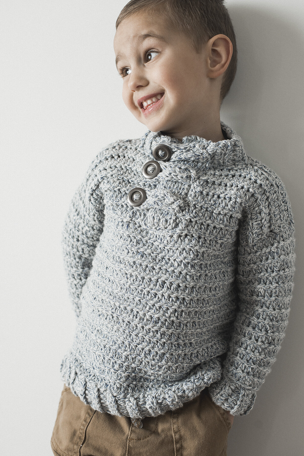
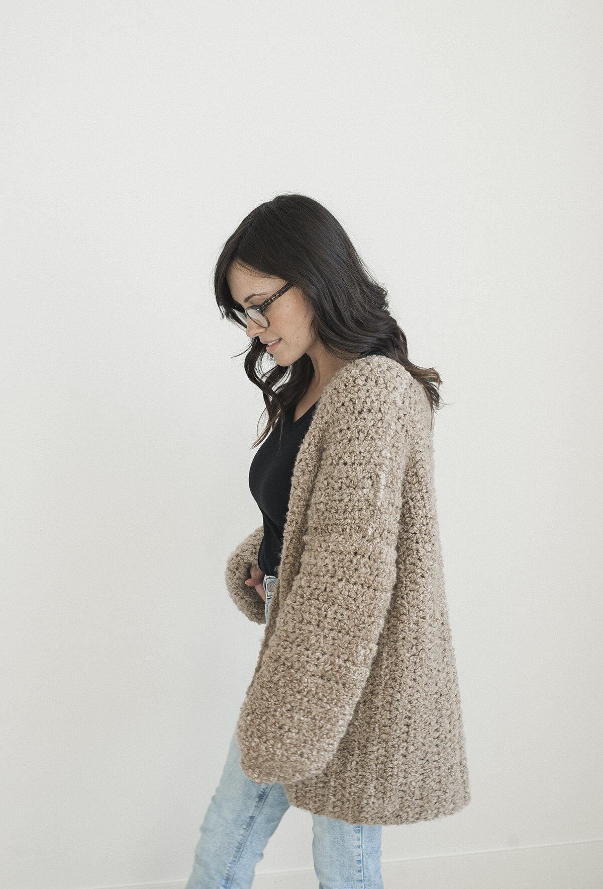
So that means even the model wearing your hat is a prop to your product. There are plenty of photos I take of just myself with a white background wearing one of my pieces. Nothing else is in the photo but me and the product. See below:
Just me & the Varsity Sweater I designed. Simple enough, right? Sometimes that's all you need to showcase your product. Simplicity is just so good sometimes, ya know?!
Other times it's good to showcase your product at a specific place- whether it's a bedroom, coffee shop or wooded forest. Again, you're painting the picture for your customer, and showing them where they could wear your piece. Helping them imagine it in their own lives, as if they were the model in the coffee shop wearing the cute hat you made and sipping a latte. This, to me, is an amazing way to showcase your product because you are showing what life in your product would look like. I think it's golden! And this is something I'd really like to work on in the future... I often times go to my safe place of taking a plain photo of just me with a white background. Which is all fine and dandy-- it works. But I really don't think you can beat showing off a scenario of where you product could be worn or displayed. See an example of a photo below I took of a sweater I made in a specific location:
A photo of the Homebody Sweater in it's natural habitat: my home. haha In this photo, I'm setting the scene of how someone might enjoy their own sweater-- on the couch with a cup of coffee with a cozy blanket nearby. Can't forget the fun little Aztec Wall Hanging in the back!
So some questions you may want to ask yourself before taking photos of your product would be:
-Where would you picture yourself or your potential customer wearing your product? Coffee shop? Downtown? At home? In line at the school pick-up? (lol, ya never know) Out camping?
-If you were shopping for your item, what kind of photo would you like to see and say, "Dang... I have got to buy this thing"?
-What kind of girl/guy would want to buy this? And what does a day in the life of them look like? Take your model to the place you would imagine them being..
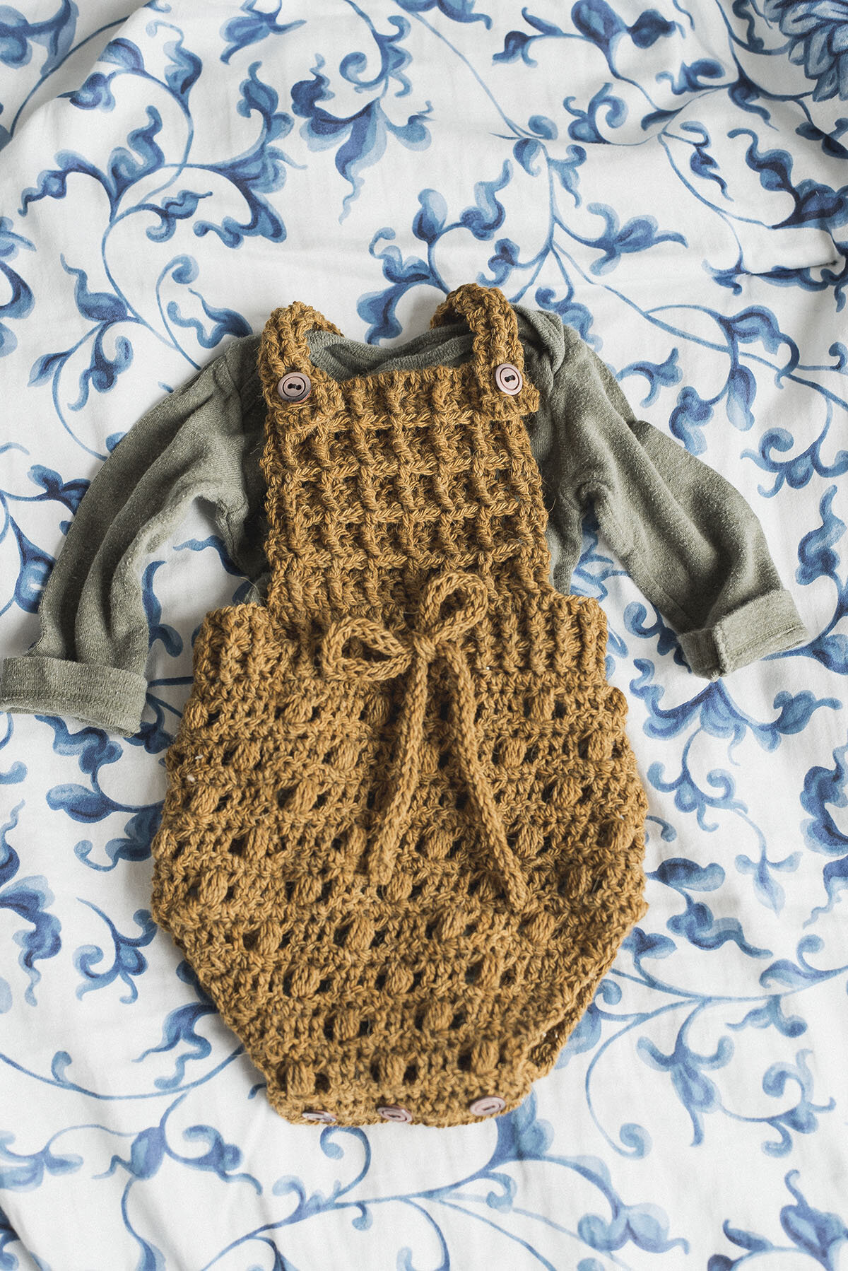
While I think using a model is a really powerful prop, it's definitely not the only way to present your product. Lots of times, you'll just want the product plus some other objects in the frame. Let me show you a few of my favorite examples of photos I've taken using props:
For this image I wanted to capture my farmhouse washcloth with some autumn feels to it. I thought it'd be neat to showcase it with a whole bunch of kitchen stuff, including apples, to make it feel warm and comforting. When I look at this pic it takes me to fond memories of cooking yummy fall treats inside while the weather outside was dreary and cold.
I like the staging on this pic because while it's simple, you also can imagine these pretty washcloths in your bathroom. I loved the look of the pretty bar soap with them as well as the rock to kind of give it a natural aspect
I love this photo because it just gives off all sorts of comfy vibes. Coffee is always a plus for me when it comes to photos. Plus the pillow in the corner really ups the comfy level. While the metal spring with the dried flowers in it is kind of random, I think it adds a nice touch to it for some reason.
While this isn't exactly a finished product, it's still a good example of props. I added the lights to provide kind of a magical feel to the shot-- which is a good thing to note. Certain props can bring certain feels to your photos. Like a piece of greenery adding a "natural" touch for instance. I added a few things I found at the park on a walk found in the upper corner of this pic.
This one is a good example of an accurate representation of the product. This was for a tag download, and I think adding all the things that I had to use to make the tag would be a great way to display the product. In a way you're telling a story of what your product is.
After you get into staging your photos, you'll begin to notice in other people's photos how they utilize props. It's like a whole new world! Because until you have to stage something, you don't realize all the things that go into making a picture appealing.
Here are a few examples of good props to use for different "feels":
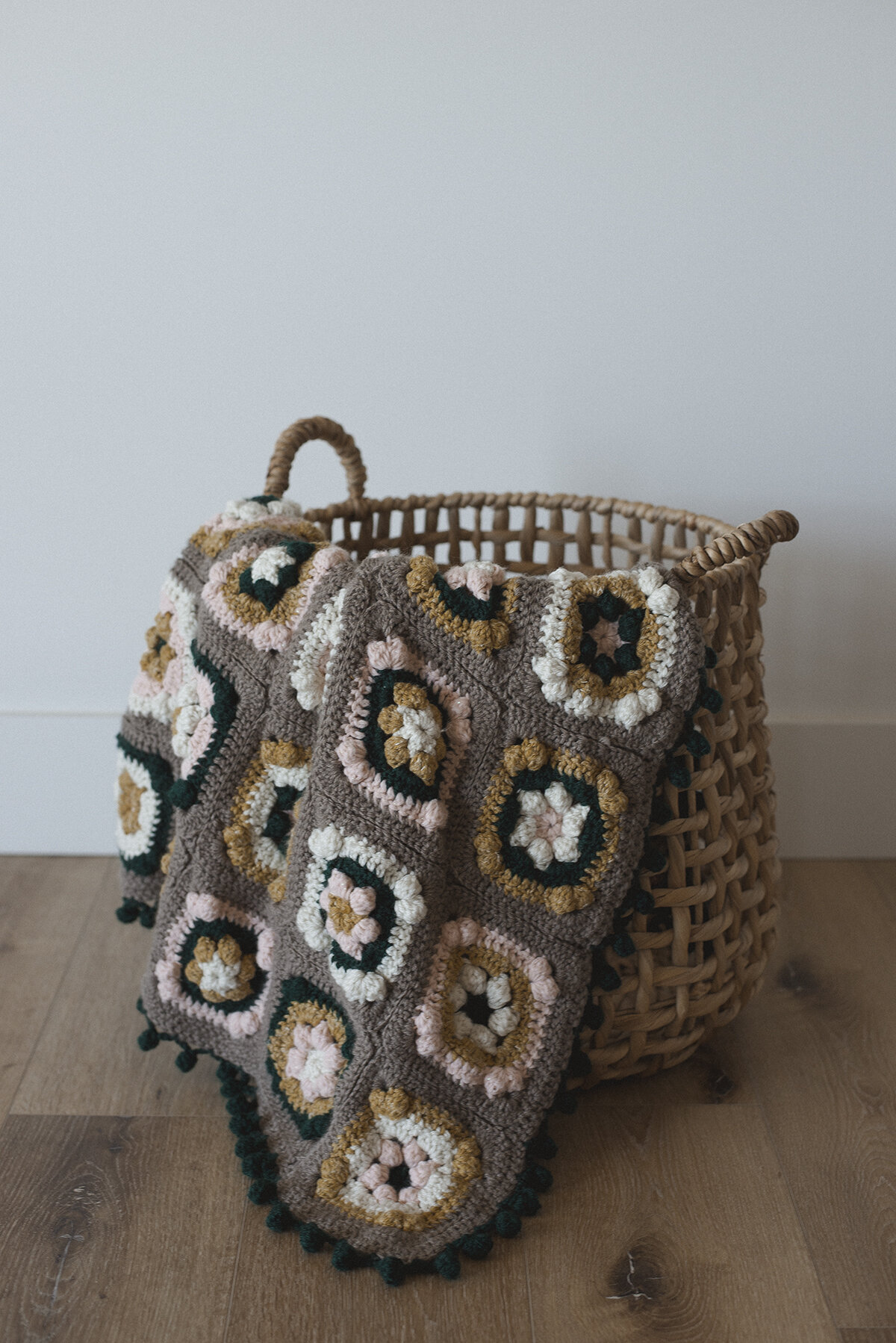
-Cozy: fuzzy and soft-looking fabrics and blankets (or really any kind of textiles), a cup of coffee or hot chocolate, string lights, yummy treats (I dunno about you, but that equals comfort for me lol), a fire in the background, candles, anything do with a BED, a cozy nook
-Natural: Leaves, sticks, rocks, stems, flowers, pine cones - anything found outside! Even the faux stuff! Muslin, fresh produce, natural wood, leather
-Rustic: chippy paint, old wood, old stuff found at antique stores or estate sales -like old newspapers, vintage patterns, old baskets (so much to be found at antique stores!), twine, steel tray, burlap, wood rounds
-Crafty: scissors, material scraps, string or jute, pencils and journals, a pair of glasses, needles, hooks, old button tin, basket full of thread
-Cheery & Colorful- all things bright- sprinkles, different-colored ribbon, patterned fabrics, colored posterboard, splattered paint, colorful dishes, flowers- even fake
-Girly- lace, pretty fabrics (silk, fur, velvet), vintage perfume bottle, dresses, flowers, old rings and other cute accessories, florals, dried flowers,
Like I said in one of the captions above, you are essentially providing a "feel" to your photos by adding certain elements to them. Say you're making a cute little cozy for a mug... some super cute props to toss in the frame would be some scattered coffee beans, a vintage spoon, perhaps some yummy cookies beside it (can't go wrong with cookies). The mug could be sitting on a wooden tray thats on a couch or bed with lights in the far distance or even in front of a fire.
I guess you probably get the picture.. I think the main thing to really do is to put some real good thought into appropriate props to pair with your product to bring it to life. Again, so the customer can imagine it in their life. That's what it's all about! It is your job to give them that presentation.
Backdrops
Like props, the backdrop you decide to use for your product can really add to the feel you're going for with your photos. There are so many options and ways to use objects as backdrops. I'll tell you what I use, as well as offer a few other good ideas you may like.
So I'm going to start by saying that I am kind of a tight wad. haha. Like if I can make something myself, or find a cheap option, I'm all over it. So those are the kinds of backdrop suggestions you'll get from me. I'm in no way a fancy-schmancy-gotta-have-the-best-stuff photographer, and I mostly just use "what works" for me. If I can make something look pretty with a 98 cent poster board, then heck yeah, I'm all for it.
I have a handful of backdrops for my photos that I use regularly. Most of them were free, if not close to free. I took a few pics of the ones I use...
I found the big brown pallet behind a dumpster, and was actually going to use it to make a sign for my home, but decided it'd make a great backdrop instead. And yes, it is sporting some lovely bird poo still that I haven't washed off. Don't judge. ;) I use this one quite a bit, because I like the rustic look it has. It is pretty rare to find a pallet that looks like this, but you could always take pallet wood and craft your own.
...Which is what I did with the white one in front. I took my jigsaw to a pallet I also found by a dumpster and cut some pieces to fit on a piece of plywood and hammered them all on. Then I painted it white and took my sander to it, et voila- a pretty & chippy backdrop that I actually use quite a bit
Also you may see peeking behind the brown pallet a black poster board. I use that sometimes for a simple backdrop. I also have a white one I use quite a bit. So, so cheap at the dollar store or Walmart!
These pieces of wood were actually one huge piece of old barn wood to begin with. I found it at a re-use it center and had them cut it for me into these pieces! I love love love the chippiness.
This is actually extra pieces of laminate flooring my mom had left over from her basement remodel. I thought it'd look pretty killer in some photos so I asked her if I could snag it! Since I don't have pretty wood floors of my own to photograph stuff on, I use this! Use what you've got folks! No excuses ;)
Here are a few examples of my photos using the backdrops:
In this photo I've got the DIY white pallet wood backdrop on the bottom with the plain white poster board on the back side.
The DIY white pallet backdrop in action again
This one is actually on our white bed comforter!
My mom's laminate flooring..
White poster board provides an awesome simple backdrop..
The pallet I found by the dumpster!
This photo was taken on my garage floor! You don't have to be limited by your formal backdrops-- cement worked just fine for this pic!
Here's that old barn wood!
This one's easy-- my white wall!
Some other options for backdrops include:
-the roll-up vinyl photo backdrops-- you can find these at a lot of craft stores or online. The only thing with these is you need to be careful because some of them can look a bit fake, in my opinion. They are really handy though, how they just roll up when you're done with them.
-fabric, or even faux fur
-a wooden table/desk
-peel n' stick vinyl
-spare tiles
-shelf lining (the stuff you put inside drawers)
-wallpaper
-a blanket
With the use of props, location/settting, and backdrops, you'll get the "feel" you want for your photos - what you want your customer to experience when they come across your photo and ultimately your product. It'll obviously take some practice to get this down just the way you'd like.. but so so worth it for your business' success. Like I said in the previous post, it can make or break whether or not you get a sale. Your customer doesn't get to touch or try on your product, so you better give 'em one heck of a show through the photography of the amazing stuff you make.
And I understand staging and setting up a good photo doesn't necessarily come naturally for some. Or maybe that's not what lights you up. But I think we all can agree it is so valuable. And isn't something to fall by the wayside, or to be scared of. You'll never ever, ever get to where you'd like to be with your photos without actually rolling up your sleeves and giving it a go.
And with that, I think I'll conclude this post on staging your photos. I really hope this brought some value to your life.. Check back next week, because I'll be talking about camera gear and tips on taking photos. It'll be a good one!
As always, happy making (or today, photo taking),
Meg
