Drawing Inspiration and Finding Your "Style" When it Comes to Taking Your Photos
/**Disclaimer: I am in no way a "professional photographer". I do, however, have plenty of experience in taking photos, as I've been dabbling in it for years. I'm just sharing some things that have helped me!**
Hey you!
I'm here today to talk to you all about p h o t o s....
Ya know, the thing that has a great amount of power when it comes to your online business-- it essentially can make or break a sale. Photos are, in a way, a representation of the quality of your business. And I realize how backwards that may sound- because really, most may think the product and creations are the star of the show. Which they should be... but if you don't have a good and clear photo of those products, they're worth nothing in the eyes of a potential customer.
If you think about it, it makes sense. When you're shopping online, you may not realize it- but you're really judge-y about where you want to spend your money. I mean, I know I am. There's a good amount of trust you're putting into a business when you hand over credit card numbers to buy something you've never even seen, touched or tried on before...
So why would you think it would be any different for your own business??
If you were a complete stranger who has never been to your online shop before, would you be "wowed" by your presentation of products? Would you think, "dang... I'm pretty sure I need that hat!"? Or is it more like, "eh, I guess thats a cool hat, but I'm not so sure about buying it because I can't really picture myself wearing it"?
Because that's essentially what you're doing-- you're painting a picture (or literally, just taking one lol) for the person who may buy your product. You're showing them how it's going to look in their life. Unfortunately you don't get to hand them the product online and let them touch and try it on-- you've got display one heck of a photo to really give them a good idea of what your product is all about.
Something that helps me is I always try to think in the mind of of the potential customer or reader. I even sometimes think of an imaginary "ideal customer" and try to picture her seeing my photos. To try to wow her with the prettiness of my photos in a way.
While I do keep in mind my ideal customer, I do really value what pleases my eye. And I think you've got to find a good balance between what you fancy plus keeping in mind your guy or gal.
And I do realize that can be a bit difficult to figure out... because maybe you're just starting out-- maybe you have no idea who your "girl" is or you don't even know for sure what kind of photos you even want to take. And I get that... because I've been there. And sometimes I still even find myself doubting my photography skills or questioning my editing style. In my opinion its a never-ending learning process. I'm always looking for ways to improve and so should you!
So... let's get down to business..
In this post I'm going cover the subjects of inspiration and "style" (branding?)
I thought I'd touch on this subject, because it's actually an area that I actually struggle in from time to time, and I figured I may be able to offer some insight into it.
One of the biggest things you hear about when it comes to business, is "branding". I feel like that term can cover so much, and can even mean different things to different people. I found a couple great definitions of branding, and the first is by the Tronvig Group, and it's summed up this way:
"It’s [branding] what sticks in your mind associated with a product, service, or organization—whether or not, at that particular moment, you bought or did not buy."
Another great way of explaining branding is from Small Business Trends, and it is 👌...
"..it is something that triggers associations in our minds. Branding is about creating an identity. It’s what sets one company apart from another. In short, it tells us what we can expect from that company. It’s about the perception people have of the company.
I dunno about you, but that definitely makes me think.. it makes me wonder what kind of impression I'm making on my customers or audience with my photography. It also really clarifies what kind of photos I should be taking and the styling and editing I should be doing.
I'll use my "branding" for an example:
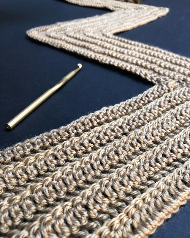
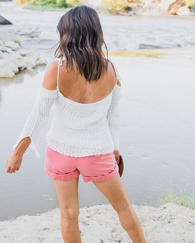
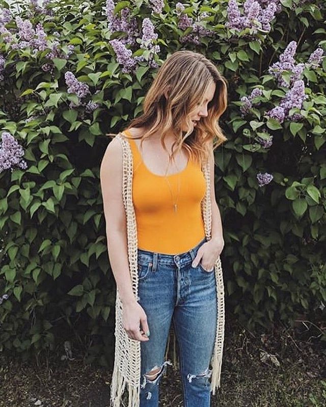
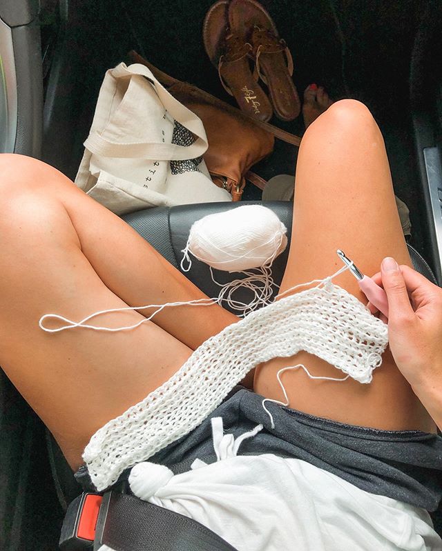
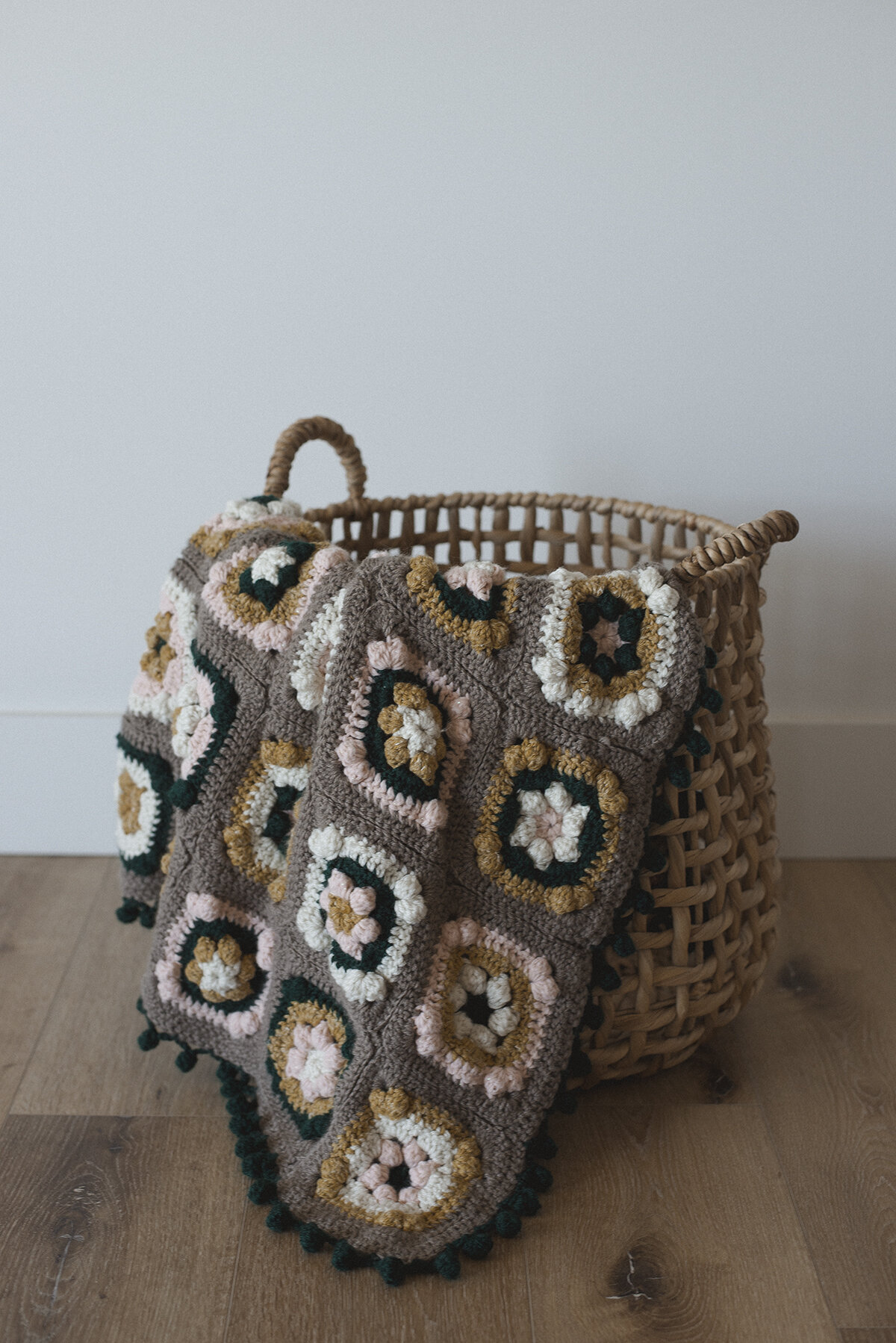
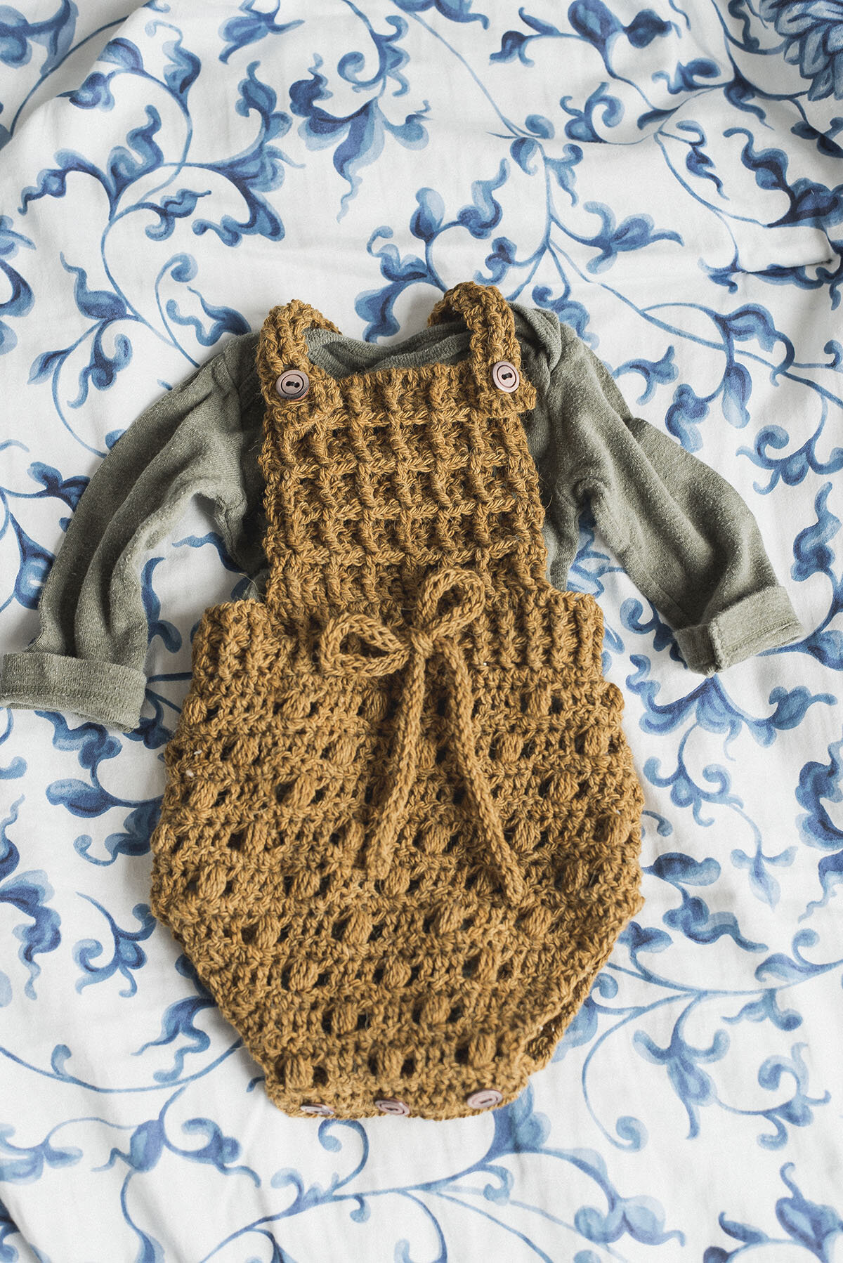
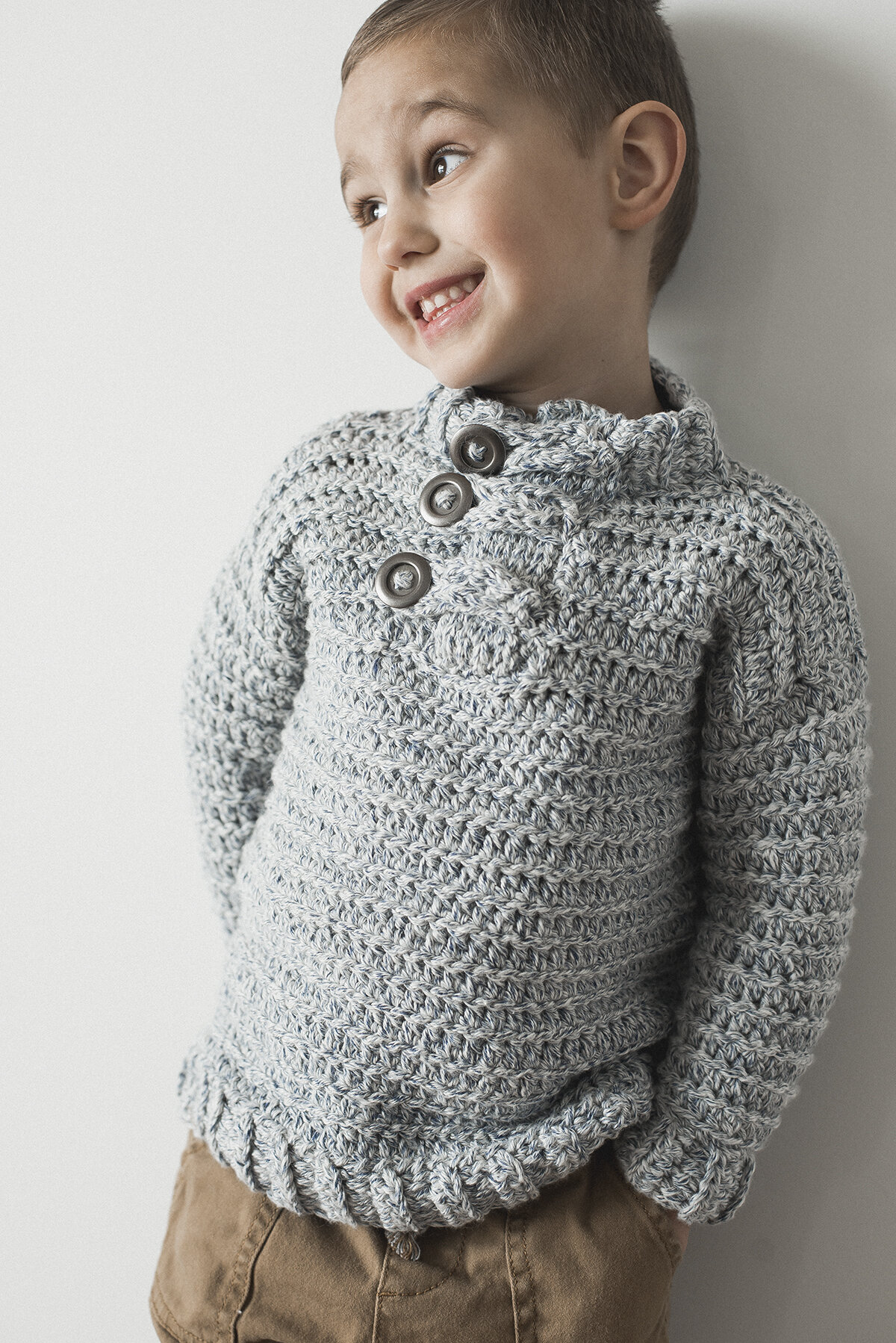
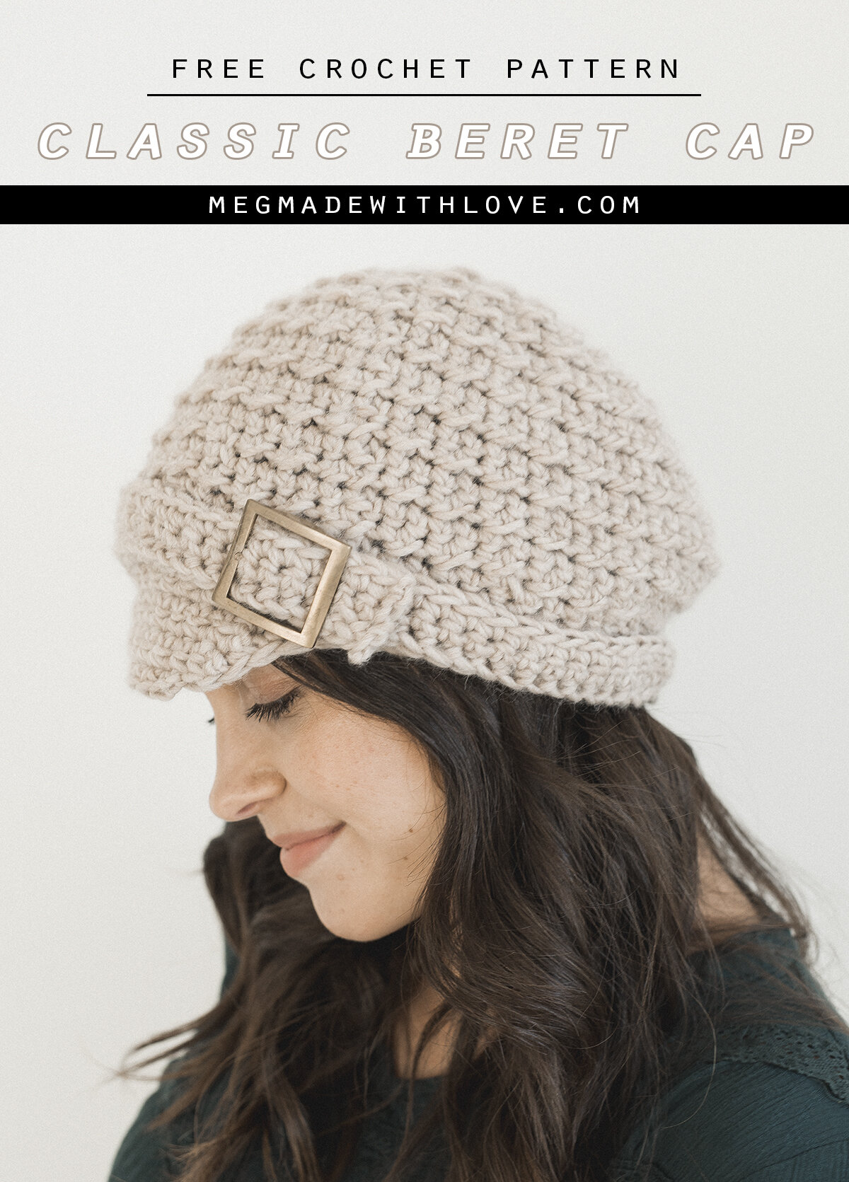
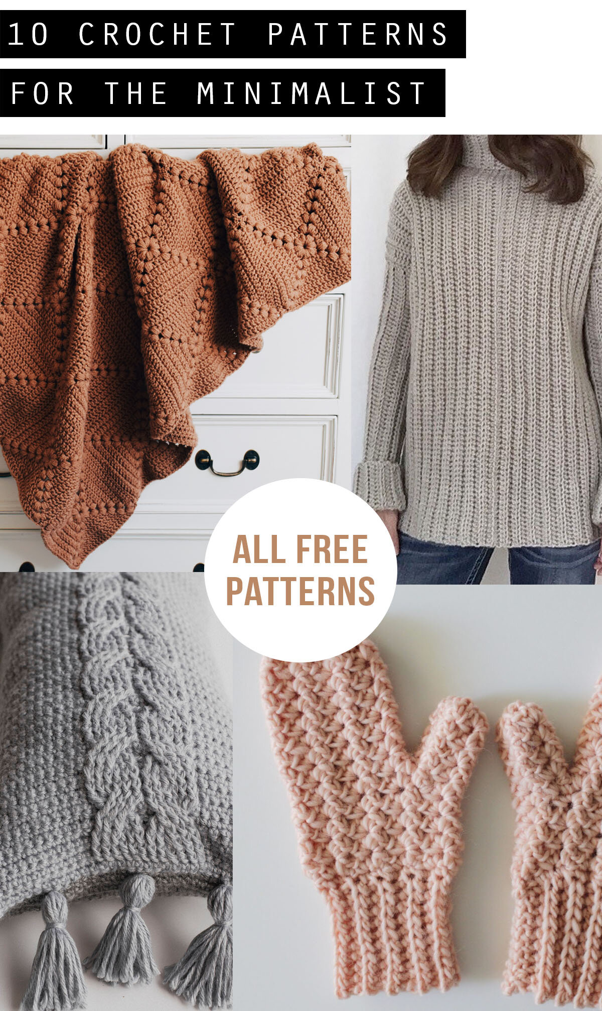
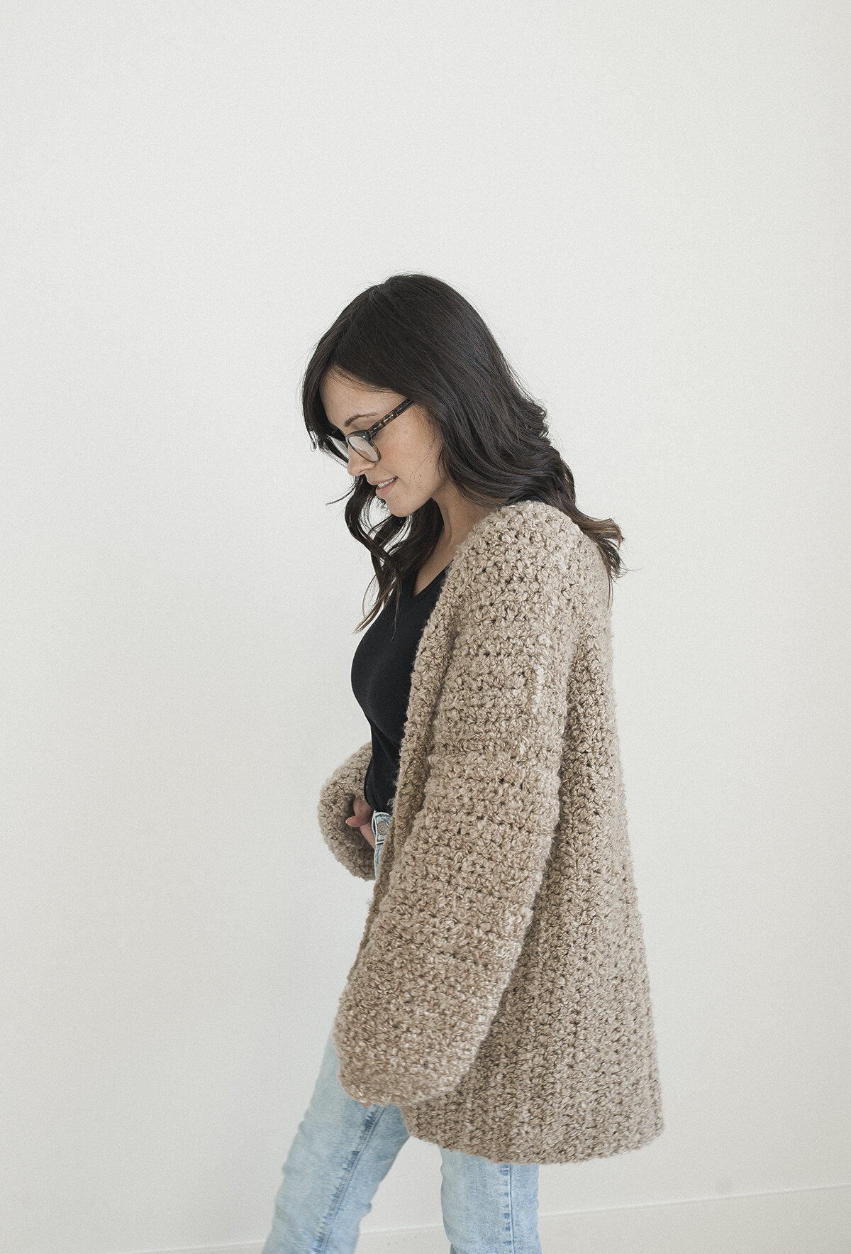
I like to sum up my style as simple, cozy, rustic, neutral and laid back. And by sticking true to those descriptors when I take photos, I create a cohesive "feel" to what is Megmade with Love. My goal is that if someone were to randomly see a photo I took, they would know instantly that it was something of mine. By no means have I perfected this-- I still struggle with staying true to my core descriptors. I think it may be because I generally just like to make things look pretty. And that can be done in so many ways. But I'll get into why it's not okay to just point your camera at any ole' thing or edit your photos any old way...
I'll use my Instagram for example, because that is a great way to display your "style" and if you have one little image that just slightly off brand... it truly sticks out like a sore thumb. I'm going to show you an incident where I didn't really stick to "brand". Here's a screenshot of my recent feed:
So you may just see a whole bunch of photos, and think, "cool, what of it?" Well, if you really analyze them all together. You'll see a couple that really don't fit in with my descriptors. Check out the one in the second row on the very right... it's pretty busy, well, just compared to my other photos-- it was actually another person's photo of them working on one of my sweater patterns. I actually really like the photo, and that's why I chose to use it. But I should have thought about what I was posting, because it really wasn't a good reflection of my business. I decided to use that photo in a pinch, because I was out of town and was lacking photos. I kick myself for it now though, because it would have been totally okay to just not post that day, and spare myself the stray photo that doesn't really belong. Another example is the photo to the left of that one, another customer photo. This doesn't necessarily fit in with my brand because of the colors that are in the image. And again, it's not that there wasn't beauty to these photos-- I thought they were beautiful, they just don't exactly depict what my business was about! (P.S. I don't think these photos really affected much, because they aren't too terribly off-brand. I just thought I'd provide that example!)
And you may be thinking I may be a little crazy thinking like that about those couple of photos like that, but.. I mean, I really value the "experience" of the people who follow along with Megmade with Love. And I really think you should be valuing that about your own business also. Because you do chance confusing your audience by presenting various styles of photos. People want a clear and consistent definition of who your business is, it's just the way it is. If you think about it, the bigger brands you know and buy from all stick to a common set of principles when it comes to what they present. It's fun to take note of it when you view their websites or even Instagram accounts. It's so pleasing to the eye to have something be cohesive. You'd be surprised how important it really is!
So now you may be thinking, "I don't even know what my brand is even about!". And to that I've got a couple of things that may help you...
Make a Pinterest board for photo inspiration
This is something I do, and I think it really helps you figure out your "style". If you are scrolling through Pinterest or really any website, just pin the photo that strikes your fancy to your board. And when you go to that pin on Pinterest, just scroll down, and it will present you with a whole bunch of images that are similar to the one you just pinned. Then you can find more stuff that's right up your alley. From there, once you've got a good amount of pins in your board, you can look at it as a whole and pick out the commonalities of the photos. Are they moody? Bright and happy? Rustic? Lots of white? Once you figure out the commonalities, you have an idea of what you can shoot for when it comes to your business' photos.
Draw from your "idol" brands
I think this is a good one, because it's easy to pinpoint what brands you are drawn to: where do you spend most of your money on stuff for you? What brands to you admire or enjoy following along with? When you're looking to find your unique style for your brand, a great place to start is channeling these companies. If you love the way Anthropologie has super simple colored backgrounds (see below), give that a try with your product! This doesn't necessarily mean you need to just copy everything another business is doing, but can be more of a little start-up for where you'd like to head with your personal style.
Figure out who your "ideal customer" is
I wanted to include this because doing this really does bring some clarity to what kind of image you'd like your business to portray. If you put a face to who your creating for, it helps you stay focused on the specific "taste" of this person. It's kind of just like defining the "descriptors" that I talked about above with my own business. It hones in your style to make it more cohesive and clear. To discover who that guy/gal is for you I'll send you over to fizzle.co-- it's a link to an awesome podcast episode talking all about target customer-- it's very practical and easy to understand. While you're there, listen to their other episodes on small business. They're great. I apply a lot of their stuff to my own business!
Antrhopologie has a great cohesive look-- bright and airy pics with simple muted-color backgrounds.
Once you get going or have a better idea of what you're drawn to, I think it'd be good to come up with a handful of "descriptors" for your own business. Ya know, like the ones I mentioned above for Megmade with Love. I think these are important things to remember. And even to write down on a sticky note, so you can remember what your business is all about when you're in the midst of photo taking/editing/planning. To basically have a set of guidelines to go by so you're not just running wild and free with your photos.
And this may come easier to some than others. Like, I feel that some people just have a natural tendency to know what they like and stick to that. And that's amazing. But I have a habit of venturing off into photo la-la land (squirrel!) where I like to experiment with different styles. And that's not to say that is really so wrong. I'm just saying that you risk throwing off your customer/audience when you bring stuff to the table that their not used to. And it can be a turn-off to be all over the place. So that's why I like using those descriptors as a guideline-- to reel me back to my roots when I've lost sight of who I am when it comes to my business.
When it comes down to it, it's just gonna take practice. And once you start getting your stuff out there, you'll realize what you like, and don't like. Or what customers responded better to. You'll find a favorite way to edit or style the photo, and hopefully get a cohesive and eye-pleasing style.
Stay tuned, though, because coming up I've got THREE more posts covering more about photos. The next one will be fun.. I'm going to talk about setting up your photos--everything from photo props and backdrops to creating the "mood" for your photos.
I hope you found this post enjoyable, and that it provided some good practical advice for finding your unique "style" when it comes to taking photos.
Take care!
-Meg
